Website UX, UI & IA
Lead UX Designer - See some of the projects I complete below.
Corelogic Property website
2023
Working apart of Ogilvy group, I help visualise a new core section of the TAB betting platform. Creating functionality and strategy to inform owners of horses with data, history and betting opportunities while gamifying sticky opportunities for users to choose TAB over rival betting platforms.
Uncle Tobys brand site
2019
Working as part of Ogilvy as lead UX designer, I laid the IA and UX strategy and research to help Uncle Toby's cereal and musli bar co, build a website that would be their stage for content for years to come. A unique combination of community driven storytelling and branded content was created to provide enthusiasts such as recipes ideas, competitions, diet ideas, and video content as a journey from the packaging to info.
JCDecaux Intranet
JCDecaux wanted to redesign the Staff Intranet to increase usefulness for all teams across their Australian and New Zealand operation, so that it became a place for single source reference of all processes, policies, contacts, news and team-building drives. A complete audit of all existing content, including documentation was taken to revitalise the site.
The process started with reconfiguring the information architecture to include all and future assets into categories that were relevant to each team. This fed into new template structures which were prototyped and tested to ensure that all stakeholders were happy with the accessability of previously hidden content. A module based system was produced to cover all interactive artefacts and ensure seamless development into a CMS to cover all future possibilities.
2023
KFC eCommerce Uplift
2021
As part of Ogivly group, I redesigned and improve the checkout flows for the KFC home order delivery ecommerce website. Working closely with the business analyst at KFC we worked through the complexity of ordering variations, creating a design and layout system to easily include the huge array of ordering options available.
Queensland Museum Group website IA, UX, UI
2022
Working with Aceik Sitecore specialists I was invited to help with the overhaul of the Queensland Museum website. Mentoring a team of designers and working closely with inhouse product managers and business analysts we worked to overhaul the group architecture and individual site maps, before wireframing, testing and implementing a new user interface design.
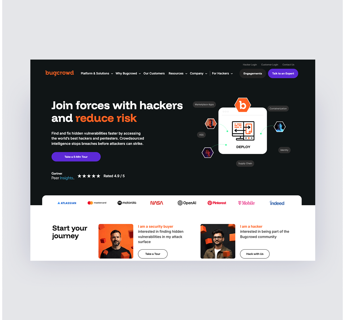
Bugcrowd homepage redesign
Leading the web redesign of a high-growth global cybersecurity platform - Bugcrowd, I worked to uncover insights about their ideal users and streamline the experience to maximize conversion. Partnering with marketing leadership and the brand design team, we redefined information architecture, optimised content flows, and introduced a fresh visual direction. This UX-led approach ensured the site aligned with user needs, strengthened brand trust, and positioned Bugcrowd to compete at a higher level in an ever more crowded market.


