Exceptionally good freelance UX
and product design.
Trusted by Australia's best thinking organisations big and small. Get started with a non-committal Free UX review today.
Call Chris - 0413 720 922

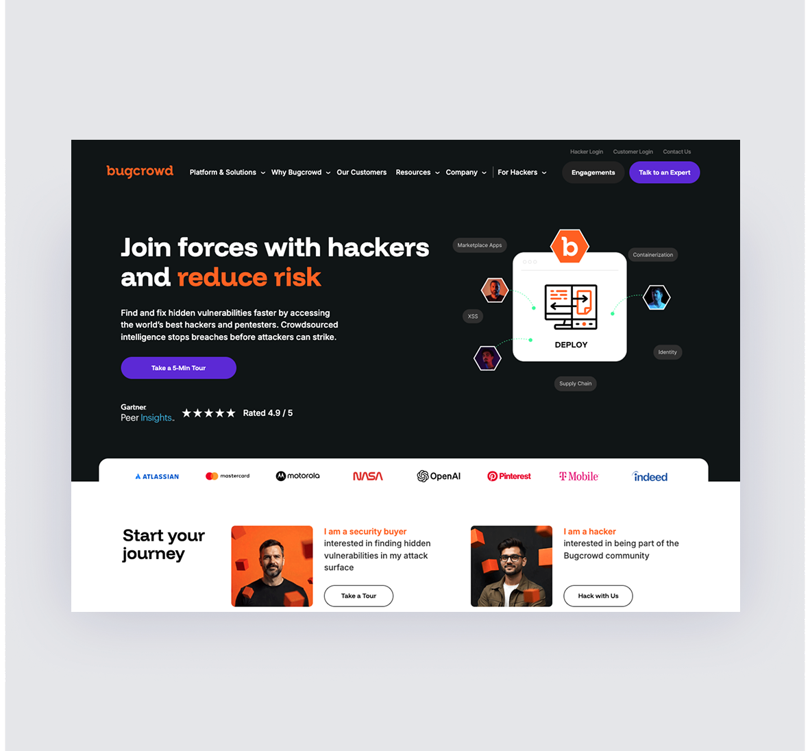
Bugcrowd homepage redesign
Leading the web redesign of a high-growth global cybersecurity platform - Bugcrowd, I worked to uncover insights about their ideal users and streamline the experience to maximize conversion. Partnering with marketing leadership and the brand design team, we redefined information architecture, optimised content flows, and introduced a fresh visual direction. This UX-led approach ensured the site aligned with user needs, strengthened brand trust, and positioned Bugcrowd to compete at a higher level in an ever more crowded market.

Daikin Airhub Airconditioning Controls
Daikin asked me to help them with new touch screen controls. We developed three prototypes from which one was taken into testing and release. Introducing AirHub. They wanted to move from the classic button style remote control to a touchscreen interactive device. Breaking away from a manual button interface meant we could implement new ways of setting rooms and climate settings for those rooms.

Tab betting app refresh

Working as part of Ogilvy group, I help visualise a new core section of the TAB betting app. Creating functionality and strategy to inform owners of horses with data, history and betting opportunities while gamifying sticky opportunities for users to choose TAB over rival betting platforms.
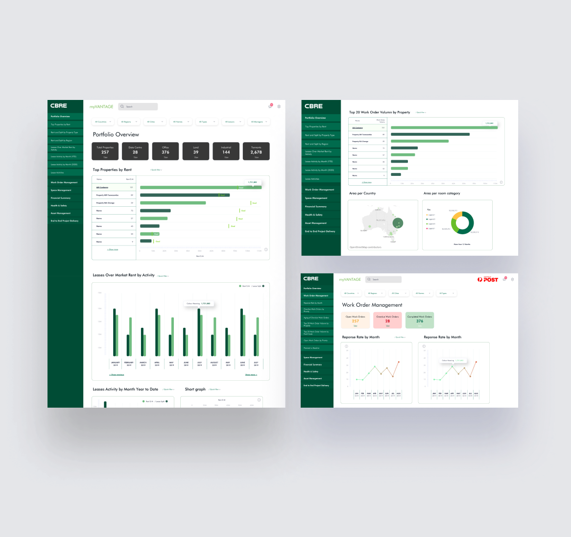
MyVantage property management system
Engaged by CBRE to help redesign of their in-house property management platform; MyVantage. Delivery included new data analysis functionality and controls including new improved layout and designs.
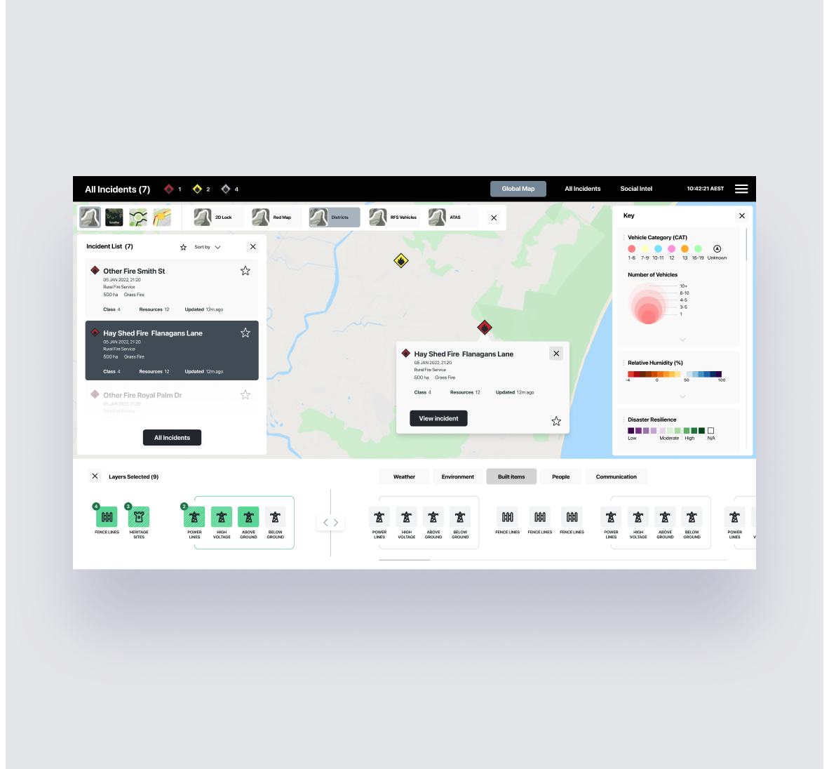

NSW RFS fire prediction software
As part of Kablamo, I mentored a team to bring the NSW RFS predictive fire management tooling to life. Working in daily sprints we reconfigured elements of the layout and tooling to best serve the operating environments of both field use and RFS headquarters, to ensure even with limited realestate the platform was simple and easy to use.


Woolworths procurement and planning system
Working as part of Maverik, I supplied design thinking to a logistics and distribution centre platform for Woolworths Group. Essentially redesigning an existing process that had been redefined and engineered over 6 years, into a working prototype in as little as 2 months. The project was a coordinated effort of stand ups and design sprints to best help understand the needs, issues and complexities on one side, while on the other understand the best available tech, limitations and functionality options to best provide a platform than helped.

KFC eCommerce
As part of Ogivly group, I redesigned and improve the checkout flows for the KFC home order delivery ecommerce website. Working closely with the business analyst at KFC we worked through the complexity of ordering variations, creating a design and layout system to easily include the huge array of ordering options available.

Australia Post parcel tracking
One of many projects completed for Australia Post, was to improve the parcel tracking dashboard to enhance product cross pollination from within the Australia Post product and service landscape. User flows for all steps were designed & prototyped in rapid prototype sprint lasting a few days, then presented back core experience leadership team, to see if enhancement and favourable ideas could ben found.

Jimmy Cricket eCommerce
Australia’s leading wall paper designer asked me to design and build a quality Shopify site for the ages. We started with a market scan and pin-pointed the best possible technology and design treatments for quotes and layout to help her CRO sky rocket. With the latest JS and the smartest UX + UI on the market, she is now reaping the rewards of an all powerful new site.