This site was built collaboratively with Claude — the whole thing, in conversation. Not a one-shot prompt and not a hand-rolled build either, but a long iterative pairing where Chris would describe the next thing he wanted (move that pill, slow this animation, change those bullets, fix that bug on iPhone) and the work would land. The result is the home, experience timeline, twelve blog posts, gallery lightbox, multi-phase screensaver, pricing engine, and an embedded AI chat — running as one cohesive product.
This post is a snapshot of what came out of that process: the numbers, the surface area, and the bits that matter most.
By the numbers
Code by type
26,634 lines split unevenly — heavy on the behaviour layer, with a chunky stylesheet keeping the surface tight, and a collection of edge-runtime functions handling analytics and AI.
Plus seven Markdown knowledge files (~18,800 characters) for the AI chat, one Netlify config, and a small Node build script that inlines the knowledge into the edge function at deploy time. The single largest file is script.js at 8,734 lines — broken into 77 self-contained IIFE modules so each feature is independently grep-able.
Pages
One home page does most of the heavy lifting. Around it sit a long-form experience timeline, a thoughts blog with twelve essays, a project lightbox template, a methods page, a websites canvas, an analytics dashboard, and a 404. Twenty pages total, all sharing one stylesheet and one script bundle so theming and behaviour stay in lockstep.
- index.htmlThe home — hero, work grid, about, trusted-by, testimonials, pricing, FAQ, contact.
- experience.html20-year career timeline with a scroll-driven progress line.
- blog.htmlTwelve essays as oversized SVG-pattern cards.
- project.htmlPer-project canvas template (Apps).
- websites.htmlWebsites canvas variant.
- methods.htmlMethods overview.
- Analytics DashboardLive ingestion view via Supabase + edge geo.
- 12 × post-*.htmlLong-form essays, each with its own pattern + colour.
- 404.htmlThe expected sad face.
Unique functionality
Twenty distinct pieces of behaviour, most of which only exist on this site:
- Multi-phase pill screensaverAfter ten seconds idle the intro pills assemble into the Eiffel Tower, then morph into a radial sun, a sound-bar visualiser, then rain, then loop. Same engine runs around Create the future. in the footer.
- Pen scribble + handwritingAn idle screensaver that doodles flourishes around real elements on the page — squiggles, stars, clouds, brackets — and writes short cursive phrases like “ingenuity unleashed” using
strokeText()with a Caveat font fallback chain. - Sticky notes & pen toolsClick the bottom-nav icons to drop sticky notes anywhere or scribble freehand on a transparent canvas overlay.
- Stopwatch dismissal gameHover the intro pills away to start a clock — clear them all to set a fastest time.
- Trusted-by SVG sweepLogos scroll-anchored to a curving SVG textPath; on scroll-out, each pill scatters with a target Y, drift, and rotation captured live, then fades to zero.
- Footer scatter canvas“Create the future.” is rendered to a canvas with per-glyph positions; cursor proximity repels each letter with spring-damped physics.
- Pricing slider with growing bulletsDrag Sprint → Formula 1 and the bar widths animate, prices count up, and per-card bullet lists grow additively as scope deepens.
- Ask AI chatVertical pill next to the bottom-nav opens a black chat panel; user questions stream back token-by-token from a Netlify Edge Function.
- Lightbox gallery + filter dropdownClick any work tile, get a horizontally-scrolling gallery with a filter pill that re-routes the project list to its category peers.
- Apps / Web / Brand canvas overlaysClick a hero card and the page pixel-dissolves into a project canvas — full-bleed thumbs spread on an oversized grid.
- Magnetic-text scatterHeadlines split into per-character canvases; on scroll-into-view, each glyph eases from a seeded scatter offset back into place.
- Mobile timeline pinVertical line follows the user's scroll position; dots fill solid as the line passes them; “London” / “Brisbane” divider lines split outward symmetrically when reached.
- Work panel rows ↔ tilesToggle between a sticky-title row layout and a 3-column tile grid; per-thumb width and aspect logic handles span-2 and tall variants.
- Hero card splayApps / Web / Brand / Experience cards animate from a stack into a fan as the hero scrolls into view; each one has a hover Lottie.
- Pixel-dissolve transitionsBackground canvas radiates outward from the clicked thumbnail when a project opens, easing thumb colour into project colour.
- Marquee with dynamic clonesTrusted-by row clones logos until it's wider than 3 viewports, then loops by exactly one set-width so the seam is invisible.
- Edge analytics with geoPage-views POST to a Netlify Edge Function that enriches with country / city / lat / lon from the edge context, then writes one row to Supabase.
- Letter-by-letter Build anythingHero H1 staggers per-character on entrance, with a global font-fit rule so it never wraps awkwardly.
- Stopwatch + pill scatter coordinationMouse repulsion pauses while a screensaver is active so the engine owns positions; on input the engine wakes, hands back, and normal hover resumes.
- SEO + URL-driven canvasTitle and meta descriptions update via
pushStatewhen a canvas opens; landing on/appsauto-opens the apps canvas.
Products in the work
Twenty real projects spanning apps, websites, and brand. The list lives in a single PROJECTS array, fans out into the home grid, the canvas overlays, the lightbox gallery, and the AI knowledge file.
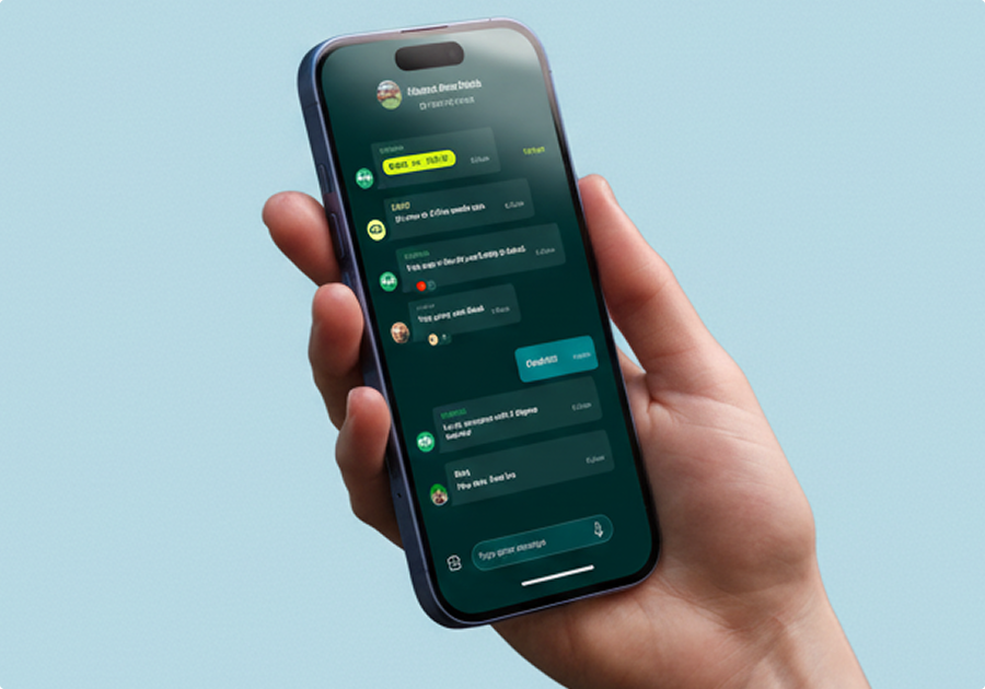 AppTab App
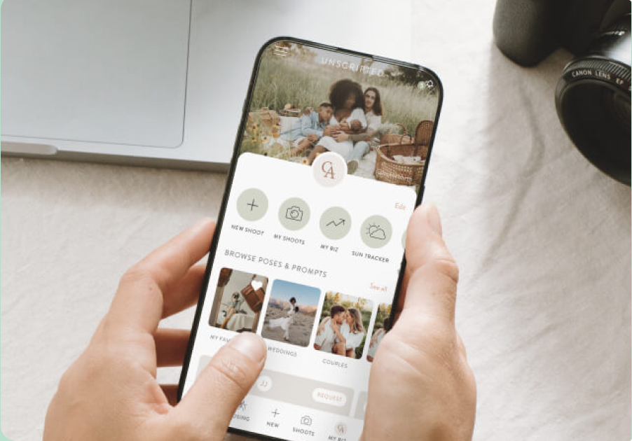 AppUnscripted
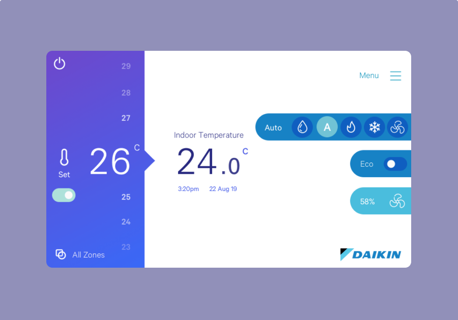 AppDaikin
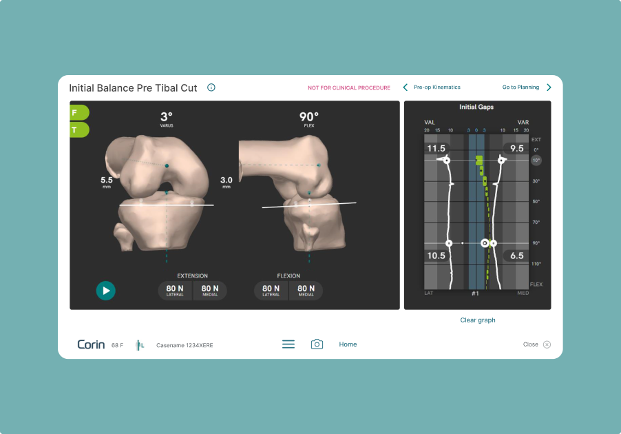 AppCorin
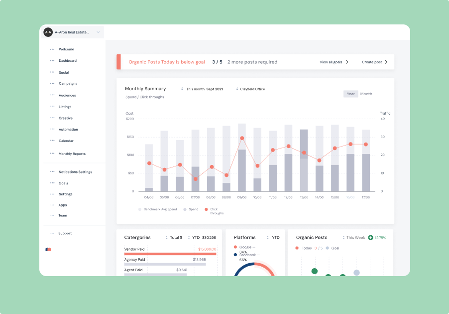 AppProperti
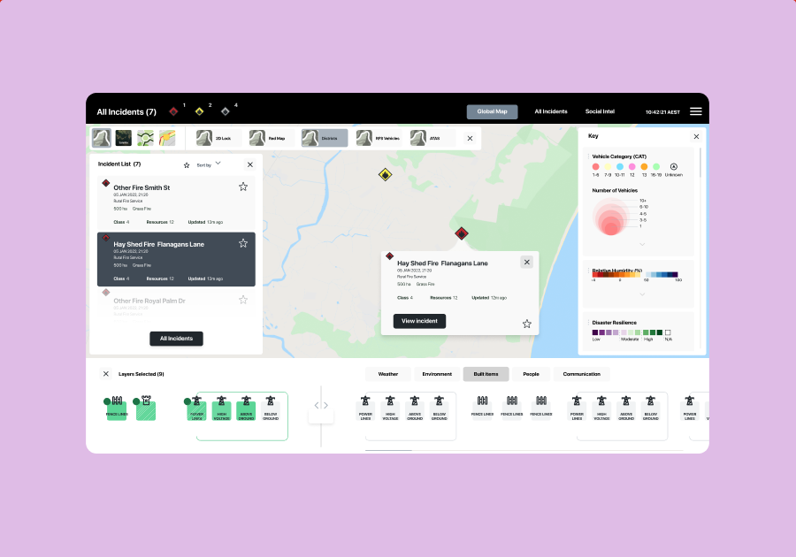 AppNSW RFS
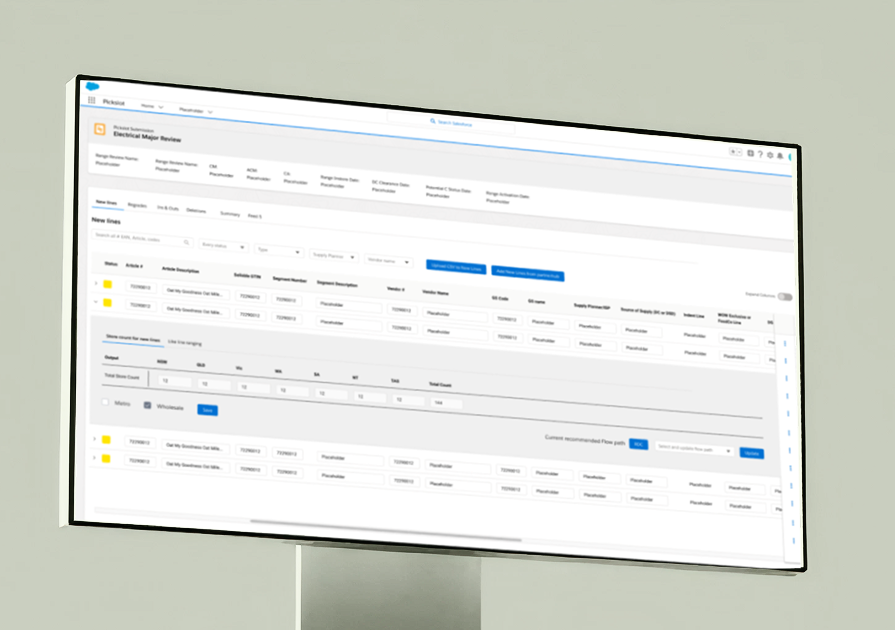 AppWoolworths
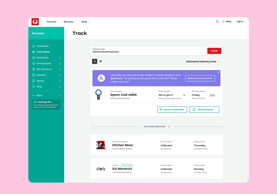 AppAuspost
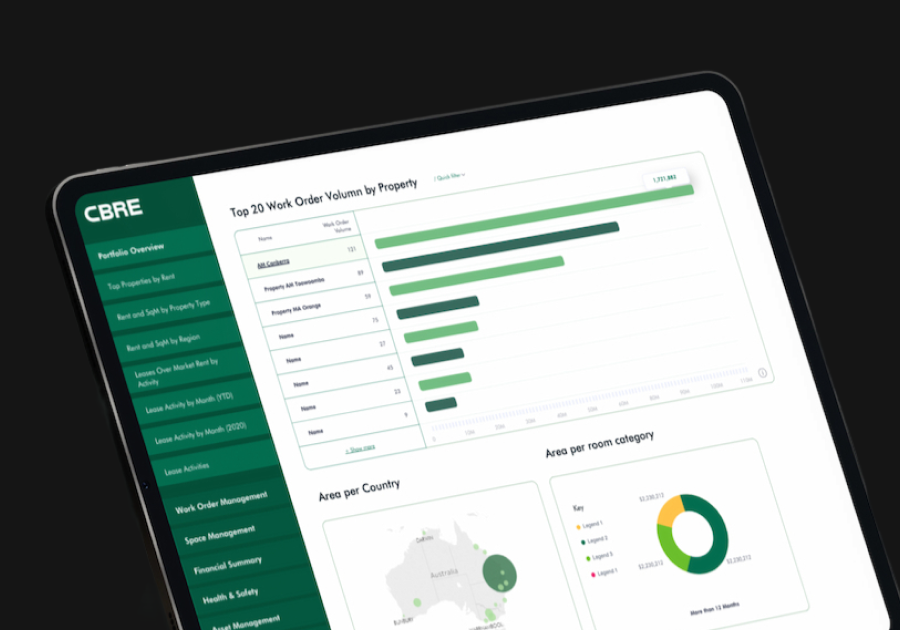 AppCBRE
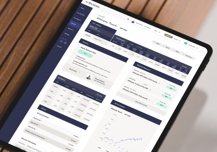 AppWilsons Advisory
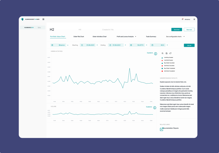 AppHummingbot
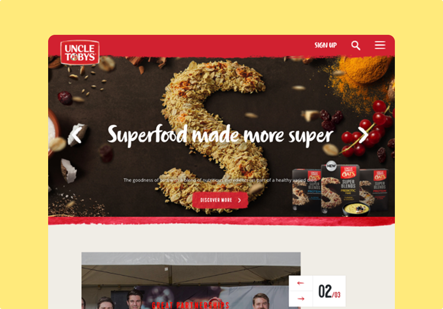 WebUncle Tobys
 WebCoreLogic
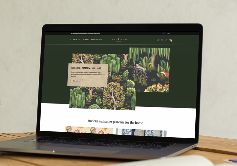 WebJimmy Cricket
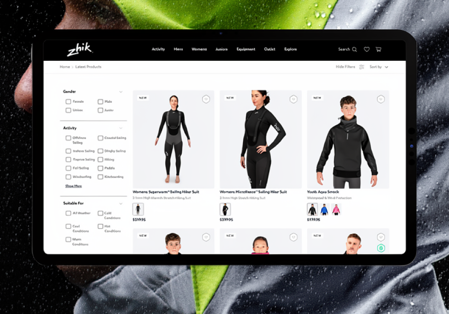 WebZhik
 WebMagic Bra
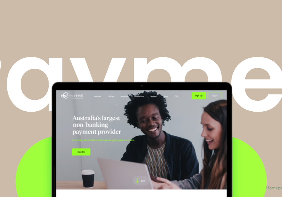 WebEzidebit
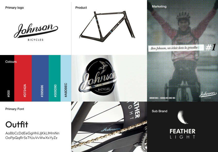 BrandJohnson Brand
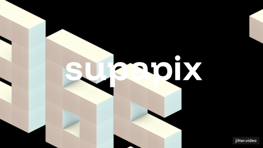 BrandSupapix
 BrandKenko
 BrandSony Music
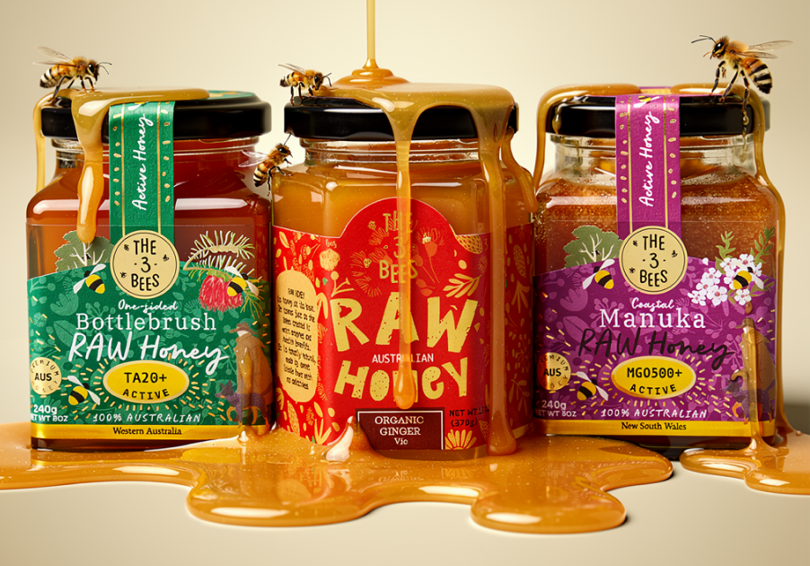 Brand3 Bees Honey
What's actually cutting-edge
Most of the page is well-known craft: clean HTML, semantic CSS, classic IntersectionObserver patterns. The bits that earn the “cutting-edge” label are doing things you wouldn't have shipped easily two years ago.
- Streaming AI chat with prompt cachingThe Ask AI panel hits a Netlify Edge Function (Deno isolate) which calls Claude with the entire knowledge base marked
cache_control: ephemeral. Anthropic stores the system prompt for ~5 minutes and bills cache reads at ~10% of input. SSE chunks are translated to plain text and streamed straight into the chat bubble. - Multi-phase RAF orchestrationThe home pill screensaver runs four chained phases (Eiffel form → sun spin → bar visualiser → rain physics) with timed transitions, each phase owning its own RAF and timers, all cancellable on input.
- Cursive canvas writing
ctx.strokeText()with a vertical font-stack falling back from Caveat → Brush Script MT → Bradley Hand. Each character is its own segment so the pen visibly sweeps left-to-right while letters stamp in sequence. - Layout-aware UI primitivesThe Ask AI pill stays glued to the right edge of the centred bottom-nav via
--nav-half-width+--nav-heightcustom properties driven by aResizeObserveron the nav itself. Add or remove an icon and the pill follows. - DOM reparenting to escape stacking contextsThe sun phase needs left-side pills above the giant Build anything. headline and right-side pills below it. Rather than fight z-index, the engine physically reparents pills into a sibling container whose stacking context lives above the headline.
- Scroll-driven SVG textPath sweepsThe trusted-by phrase rides a curved
<textPath>whosestartOffsetis bound directly to scroll position — no easing, no GSAP timeline, just a single-line scroll-to-percent calculation. - Edge geo + Supabase ingestionPage-views go in via
navigator.sendBeaconto an Edge Function that readscontext.geo(country/city/lat/lon, free at the edge) and writes one row to Supabase — the whole pipeline measured in tens of milliseconds. - Knowledge-base build pipelineA 49-line Node script concatenates
/knowledge/*.mdinto a single string export at deploy time. Edit a Markdown file → push → the AI's brain updates without any vector DB or RAG infrastructure.
Designing in screenshots
The fastest tool in the build wasn't a wireframe or a prompt — it was a screenshot. I'd see something on another site, paste the image into the chat, tell Claude what I liked about it, and within a turn we'd have our own version of the idea in code. The site didn't get designed in Figma. It got designed in a conversation where pictures did most of the talking.
Here's the rough shape of how that worked, one screenshot at a time.
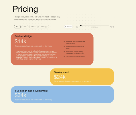
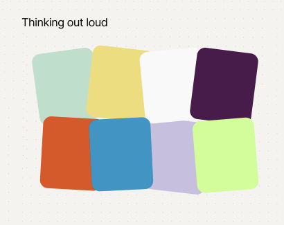
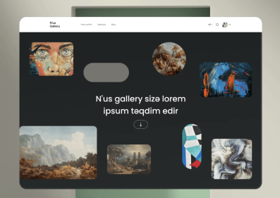
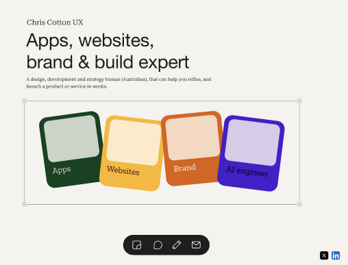
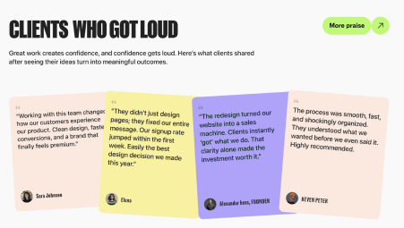
None of those steps took longer than a coffee. Every one of them would have been a half-day round-trip in a classical agency loop — brief, mock, review, revise, push. Here the brief was a picture and three sentences. The mock was a working component. The review was a glance, and the revision was the next prompt.
How the conversation went
Over a hundred and twenty back-and-forth turns, broken into a few rough phases:
Foundation. Hero, intro pills, work grid, footer, contact form, FAQ, testimonials, trusted-by. The bones.
Behaviours. Sticky-note tool, pen drawing, stopwatch dismissal game, magnetic typography, lightbox gallery, canvas overlays.
Screensavers. The big multi-phase pill engine — Eiffel, sun, bars, rain — then the pen scribbler with cursive phrase writer, then the footer copy of the same engine.
Polish. Mobile timeline, layout-aware nav, divider split, dot fill, scattered logos, pricing growth bullets, screensaver loops, dropdown column-flow, header copy.
AI chat. Knowledge base, Edge Function, prompt caching, streaming, guardrails, retries, deploy-time knowledge inlining, MCP discussion.
What it cost
No vector database. No CMS. No headless framework. Three core files (HTML, CSS, JS), some Markdown for the AI to read, and a couple of edge functions for analytics and chat. Total compressed weight stays under what most CMS-built portfolio sites send for a single hero image.
The bigger story isn't the byte count — it's that two of the things that would normally be six-figure builds (a multi-phase animated screensaver and a context-aware AI chat) shipped as side-effects of having Claude in the build loop. Those weren't the goal; they were the natural expression of “while we're here, can it do this?”
That's the thing worth taking away. The site is a portfolio. The build process is the portfolio.